Posted By Marian Hughes on August 20, 2015
It’s no secret that launching a new website is a big undertaking, involving numerous skill sets from smart messaging, positioning and copywriting to intuitive design, user interface and architecture. The process involves a laundry list of action items and deliverables and typically takes weeks if not months to carry the project across the finish line. Perhaps this is why the corporate online newsroom often doesn’t live up to its full potential as a valuable and timely content source.
So what does a winning online newsroom look like? Truth be told, they aren’t easy to find even on some of the best designed websites. We set out to identify the best practices of award-winning newsrooms to help more companies follow their lead.
Design for Your Audience
First and foremost, a web design team must remember the intended audience of the newsroom: busy press members who are working on deadline and need to find information fast. Therefore, at its core the press room must be easy to find and navigate. The link to a press room must be featured prominently on your website’s main home page. The press room also should be responsive, so media members can navigate the site and access what they need from their mobile phones and portable devices.
Segment Your Content So It’s Easier to Find
Press members turn to an online newsroom to help them find facts and learn more about a company. Segmenting your content in useful categories will make a reporter’s job easier. Key content categories that should be considered for an online newsroom include:
- A News Section featuring both press releases and recent articles, which can ideally be searched by each category.
- Corporate Information that links to fact sheets, executive bios, backgrounders, timeline/company history, locations, etc.
- An Image Gallery for logos, graphics and photos; include high-res files in different format and size for example: png, jpg with transparent/white/black background, etc.
- A Video Gallery that provides quick access to informative corporate, product and case study videos.
- A Social Media Section that includes social sharing icons as well as social content RSS feeds.
- An Events Calendar lets customers (potential or current) know where they can see company thought leaders speak or get a closer look at your product at any upcoming conferences and/or tradeshows.
- A link to the Corporate Blog (if applicable) lets visitors know where they can see more brand content.
- And last but not least, a prominently displayed media contact. Award winning newsrooms wisely provide media contacts on each and every page of an online newsroom to make it easy for a journalist to connect with the company if he or she has questions.
Must Haves and Nice to Haves
Including all of the categories above will ensure your newsroom delivers value to journalists. But here are some best practices that will move your newsroom from the good to great category:
- Include media contacts listed on press releases. Believe it or not, contact information is often deleted in the posting process.
- Add in a search function that searches only the media section of the site. If possible enable the search to be filtered by type/date.
- Provide a registration option, so reporters can request that announcements be sent to them.
- Offer the ability to download and reuse content and embed codes for videos.
The Importance of SEO Still Holds True
Don’t send your SEO experts home before they offer you insights on your newsroom. Because Google is one of the first places a reporter turns to when researching a company, it’s important that your newsroom can be found easily through search engines. To help you achieve this, use keywords strategically and monitor analytics to determine which keywords are driving traffic to the site.
Learning From the Leaders
Finding a great online newsroom truthfully can be like finding a needle in a haystack. But here are a few corporate websites that stand out above the rest and have been recognized by the industry for their excellence.
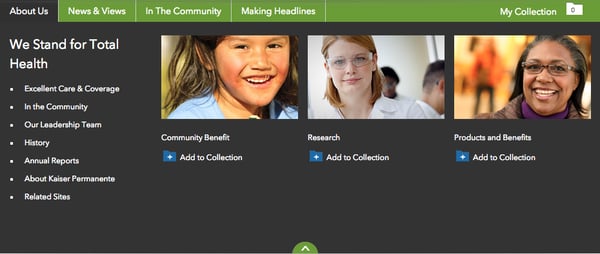
Kaiser Permanente
What We Love: The navigation labels in this newsroom are helpful and intuitive. Note how social sharing tools are placed on every piece of content. The My Collection function is especially unique and helpful, allowing journalist to compile content and send it to themselves through a single URL. The site also features feeds for its Twitter handle and blog.
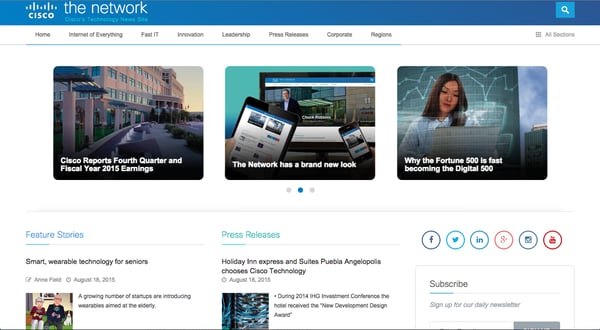
What We Love: We like how the content on this site is categorized in a helpful and easily accessible manner. The subscribe feature enables reporters to stay connected with the company long after they’ve left the site. Additionally, it features links to all of the corporate social handles, and includes its Twitter feed directly on the newsroom home page.
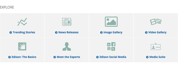
Edison International
What We Love: There were two features about this website that we found admirable: Its easy to use search function and its helpful explore hub.
.png?width=600&name=screen_shot_2015-08-20_at_11.02.25_am%20(1).png)
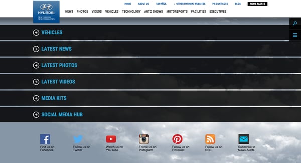
Hyundai
What We Love: The look and feel of Hyundai’s newsroom is completely unique and is designed to make it fast and simple for reporters to find what they need. We found their social media hub particularly innovative.
The Payoff of a Little Extra Effort
I know what you’re thinking: These examples are from big companies with big budgets. But if you focus on the best practices, you’ll realize almost all are approachable no matter what the budget, they just require planning and coordination with your web design team. So what are you waiting for? Taking the extra effort to make your newsroom even more helpful and valuable to the media will provide numerous benefits. Have another example of an award-winning newsroom? Tell us about it in the comment section below.