
Posted By Ashley Tate on September 30, 2022
A great infographic is a concise visual that transforms your data into an easy-to-understand, captivating storytelling tool. From basic pie charts and bar graphs to custom illustrations, the data visualization brought to life in infographics can be a key pillar of strong, engaging content for social media, your blog or website, and more.
The copy for your infographic is just as important as its visuals. When text and graphics go together like a horse and carriage, the result is successful content. Follow these four writing tips to make your infographic truly impactful.
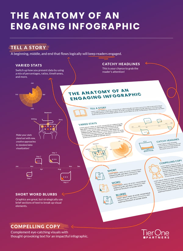
Tell a Story
When your parents tucked you in at night as a child, they opted for “Goodnight Moon” and not a list of statistics. That’s because narrative storytelling is most compelling — for both kids and adults.
Before diving in, make sure you have clearly outlined the overarching story you want to convey and think about each section of the infographic as a chapter that carries the storyline forward. Arrange your data in a way that flows naturally. Don’t jump haphazardly from idea to idea. Instead, make solid connections between different data points. This strategy will form sections that feel logical, not forced.
Have a Catchy Headline (and Subhead)
Keep your headline short and attention-grabbing. Doing so will hook the reader and get them interested in learning more. Don’t worry about conveying everything the graphic encompasses in the headline — that’s what subheads are for! The headline reels the reader in, and the subhead then gives a more solid understanding of the purpose of the infographic.
Feature Varied Statistics
Just the word data is enough to induce a yawn for some people. But statistics are essential to telling your story, and they don’t have to be boring.
The trick is to vary the format — use percentages, ratios, and more. Just avoid switching up the format when it doesn’t make sense, like when comparing two points. When possible, include other types of data as well: timeframes (years, months, minutes, etc.), ranking scales, and instructions or step-by-step processes.
T1 Tip: Don’t be afraid to get creative and explore new approaches to traditional data visualizations. Not everything needs to be a pie or bar chart!
Include Short and Sweet Blurbs of Text
A picture is worth a thousand words, but short blurbs of text break up graphic elements and reinforce or explain your points. You can include brief sections of text alongside graphics where they fit organically or in each section. Use the guideline that the text should be influenced by the data and not the other way around. Too many unnecessary words become clunky. Rely on the graphic to carry the bulk of the narrative and think of the corresponding text as providing supportive details.
Compelling Copy = Winning Infographic
Think of an infographic like a picture book: Just as kids learn about the world through the combination of visuals and text, your audience can get a deeper understanding of your data through an infographic. A balance of creative visualizations and compelling copy will help tell your story.
Learn more about how Tier One can help you craft an impactful infographic.